Kirin Ichiban uses a very unique crafting process. They only use the first press of the wort, which is the beers purest state and only the finest ingredients. This process helps to create the best flavor possible and makes it an excellent pairing with Japanese cuisine.
During the time of this project, the brands headline was Beer at it’s Purest. The brand wanted us to create a visual that represented their brewing process and that it paired well with sushi. I used the beers ingredients to not only represent their process, but to also create a visual that represented the Japanese culture.
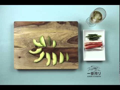
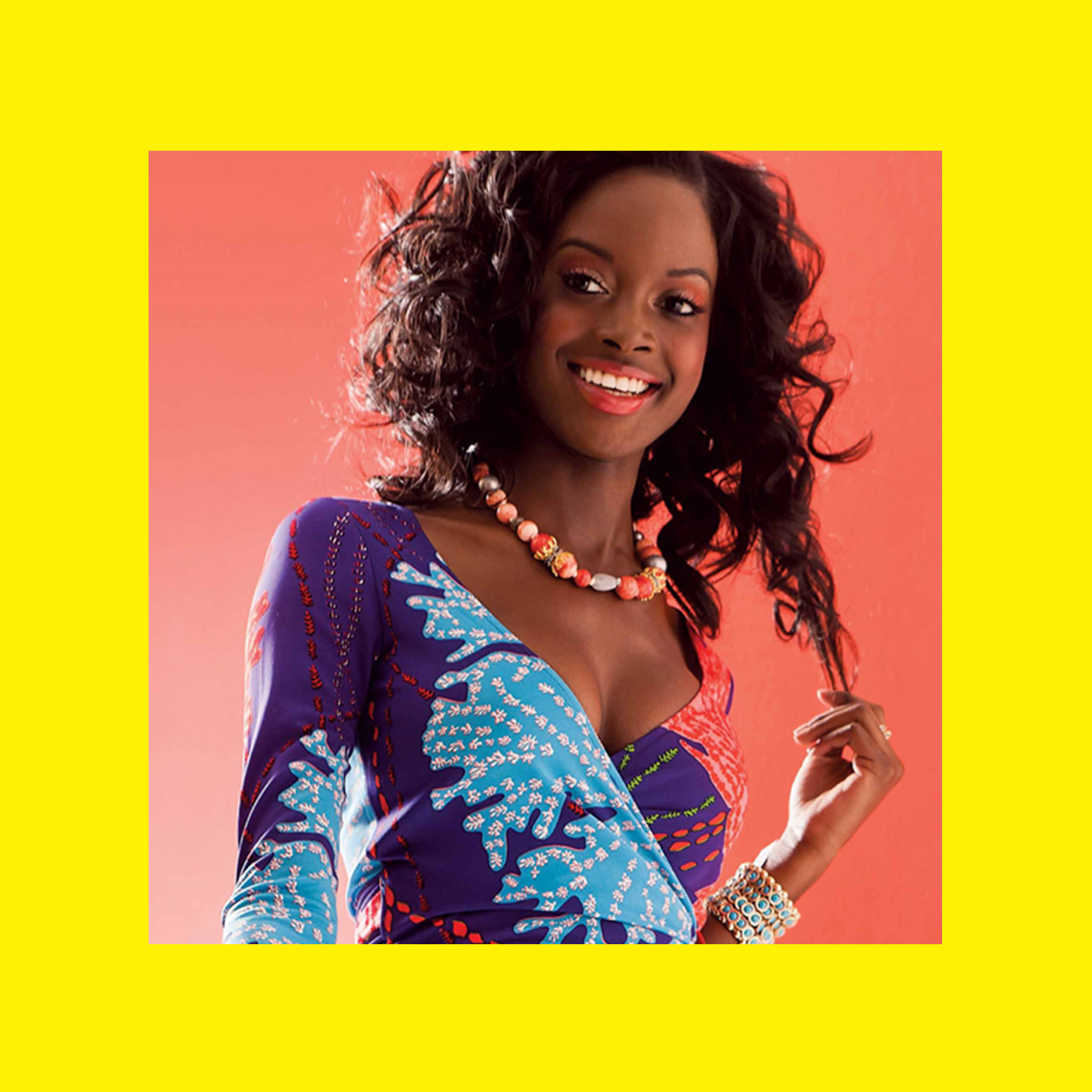
This photoshoot focused on the partnership between Kirin Ichiban and celebrity chef, Candice Kumai. The client wanted a variety of images that showed food that paired well with Kirin Ichiban.
My responsibility was to create mood boards for the aesthetic of the shoot and to create the shot list. I was also on set to art direct and make sure we got all of the content that we needed.
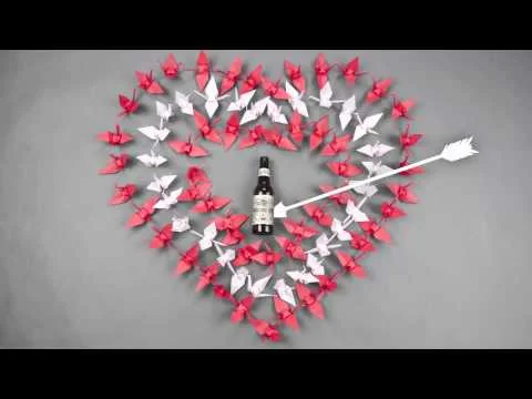
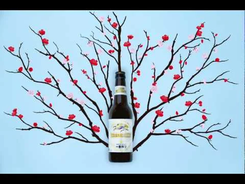
Kirin Ichiban is a brand that is rich with Japanese culture, therefor our client asked us to create a series of social media videos that represented this. We decided to create several how to videos that showed our consumers examples of origami, sushi rolling and traditional Japanese wrapping. We released these videos around the holidays to make them more relevant.
The turkey origami video won a Gold Addy at the 2014 Saint Louis Addy Awards. The sushi, cherry blossom and Valentine’s videos won a Silver Addy at the 2015 Saint Louis Addy Awards.
The client ask was to create a new look that appealed to the Natty drinking college consumer. During this time, Natural Light was releasing their new cans and packaging, so the client wanted a complete redesign of all marketing materials. So I created different scenarios that our consumer would participate in. These events include snowboarding, hanging out in their lawns, chilling with friends and just being college students. I created 10 scenarios, collaborated with local photographer Brian Cummings and used these images in our new Natural Light campaign. I did a lot of research on the Natural Light consumer to make sure that everything, including wardrobe, scene and personalities lined up with their lifestyle.
The A-List awards are given to the top retailers, restaurants and small businesses in Saint Louis. Readers of the magazine voted on their favorites. The year that these were created, A-list Awards was celebrating their 10th anniversary. Using that as a starting point, I decided to use different decades as a theme for this series.
I have worked on a variety of on-premise elements for AB-Inbev. These are just a few of my favorite examples.
The brand’s slogan at the was “Taste the Sun”. This slogan hints at the fact that Sunkist is the only orange soda that contains caffeine and that it was a popular drink to consume during the summer time. The client ask was to convey this using a single logo mark. I used concentric shapes to create energy and movement, while also forming a simple iconic sunset.
The client ask was to create printable material to hand out at Rolling Rock events. We decided to design a Zine that showcased our user generated content. We felt that it was a perfect representation of our brand and our consumer, and it was well received.
At Saint Louis Magazine, I was in charge of all their marking material. I was tasked with creating a cohesive brand standard for all of their materials.
MEDIA KIT
The Media Kit was used to help our sales department sell ad space in our magazine. The kit needed to be both aesthetically appealing and easy to comprehend. I achieved this by creating simple graphs that explained why someone should advertise in our magazine.
GLAMOUR BANNERS
These glamour banners were used at all of our events. These banners were a quick representation of what Saint Louis Magazine was about.
Ritas is a fruity, fun and colorful brand. The client ask was to create a series of visuals that were colorful and juicy, but also represented the times in which this beverage is consumed. We created fun, clever headlines that conveyed the personality of the brand and surrounded them with colorful liquids that showed refreshment. The Cinco visual uses elements that not only represent Mexican culture, but together they form an organic liquid like design.
These are a series of holiday greeting cards that were sent out to our clients. The first holiday card was filled with holiday party ideas and activities. The second card included a 45 record and suggestions on how to use it. The client could melt it into a serving bowl, decorate it and hang it on their tree or use it as a serving tray for their holiday parties. The 45 was published in Print Magazine and won a local ad AIGA award.
Busch
The client ask was to create an affordable solution for a pricing sign. This piece makes it easy for retailers to switch out signage and pricing throughout each program. It also helps the retailer create a simple, but effective display in their store.
Natural Light
Each year we would create a new creature for Natural Light. The Loch-Nat-Monster was built to extend across different stacks of beer. This enables the retailer to build a small or larger display. The Natty-Kong was a very successful creature. It was the most purchased item for the year it was made. It was so successful, they continued to produce it for a couple of years.
Rolling Rock Project 33 was an event that celebrated local music and art. While creating this logo, I wanted to maintain the integrity of the brand by using its already existing logo mark. The consumers that won a trip to this event were given State Bikes to ride around the city, so I incorporated a bike gear to represent that.
Local Deli is a local sandwich shop that only uses fresh ingredients from Missouri farmers. To represent this, I created a visual mark that was simple and included a recognizable icon for produce.
TapWiser is an Anheuser-Busch InBev app that makes it easy for retailers to order beer from local wholesalers. The ask was to create a simple icon that communicates what this app does. While sketching for this logo, I found that keeping it simple and bold works best for an app icon. I used the “T” in TapWiser to create a beer tap illustration. This logo won a Silver Addy at the 2016 Saint Louis Addy Awards.